Hello there,
I know it’s kind of ridiculous, but I just want you to know that
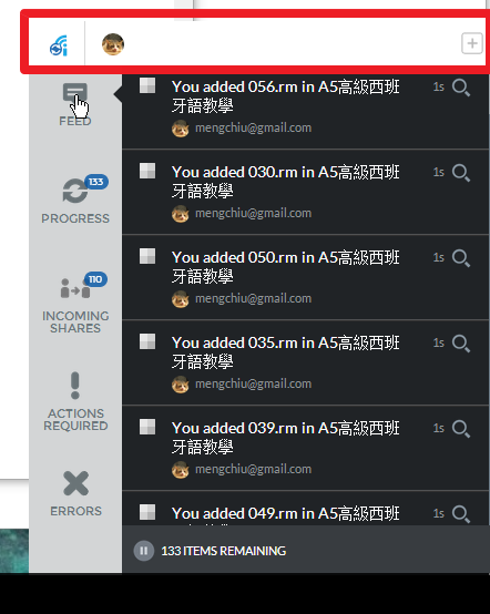
the UI of the current windows client, although it’s flat and modern,
I cannot easily see the top bar with it’s white and flat design,
especially the main part is black and grey.
I mean this part:
I’m not novice nor new to any UI,
but it took me 5 minutes to find,
actually I find it during the process of report a bug about the “my account” is missing in my client,
I snapshot my screen and finally I saw that white bar!! LOL.
![]() Anyways I love your product and services.
Anyways I love your product and services.

